Colour can transform a simple room into something genuinely impressive — but picking the right palette is harder than it looks. The tips below help you build no-fail combinations for the rooms in your residential property. Interior colour choices are deeply subjective, which means there’s no single right or wrong scheme for your home. You don’t need to obey design theory or the colour wheel to create a great combination — what matters most is finding the palette that genuinely feels right for you.
5 Tricks to Pick the Right Colour for Your Home
1. Decorate from dark to light, vertically
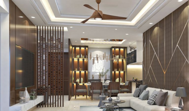
One classic designer rule: move from darker shades at the bottom to lighter shades at the top of a room. Darker flooring, medium tones on the walls, soft tones on the ceiling. It’s a low-risk approach that works in almost any space. Use heavier patterns, deeper colours and substantial furniture for the lower portion of the room and softer, lighter elements as you go up. The arrangement mirrors the natural order of the world — earth, sky, light — and feels intuitive even when guests can’t pinpoint why.
2. Take a cue from your clothes
Most of us buy clothes in colours we genuinely look good in — so it’s worth applying the same logic to the rooms we live in. If you wouldn’t wear a mustard yellow shirt, don’t pick a mustard yellow couch — you’ll feel subtly uncomfortable around it without knowing why. Pick furniture and wall colours in the family of shades you already gravitate toward in your wardrobe.
3. Make small spaces pop
With property prices climbing across Indian cities, large homes are becoming harder to come by — but that doesn’t mean a smaller home has to feel small. Light colours create the ultimate optical illusion, making rooms look bigger and brighter than they actually are by maximising natural light. Dark colours, by contrast, absorb light and make rooms feel snug but smaller. Use contrasts deliberately: light on walls and ceiling, with darker accents in furniture and decor.
4. Contrast warm and cool
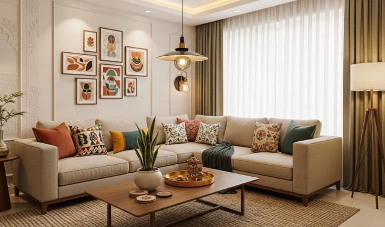
Tired of neutral, beige-on-beige spaces? Warm-and-cool contrast is one of the simplest ways to make a room feel alive. Cool grey walls paired with warmer mustard, terracotta or rust accents can transform an ordinary room into something memorable. The same logic works in reverse — warm cream walls with cool teal or navy accents bring welcome depth without overwhelming the space.
5. Follow the rule of three
The 60-30-10 rule is the most useful colour heuristic in interior design. Split your room palette into 60% primary colour, 30% secondary colour and 10% accent colour. Walls usually form the dominant 60%; upholstery and major furniture take the secondary 30%; cushions, throws, vases and accessories handle the accent 10%. Keep accent items minimal and intentional — too many small accent pieces clutter the eye and dilute the effect.
If you’re looking for new residential projects in Hyderabad to call home, take a look at Auro Kohinoor in the bustling HITEC City. These spacious 4 BHK flats in Hyderabad carry the kind of layout and natural light that genuinely lets you experiment with colour without overwhelming the space.
Official Resources & References
- RERA Telangana — Project registration verification
- HMDA Telangana — Layout approvals & master plan
Data verified by the Auro Realty Team as of March 2026.
Frequently Asked Questions
How do you choose the right colors for your home?
Consider the room’s purpose (calming blues for bedrooms, energizing yellows for kitchens), natural light exposure, room size (lighter colors for small rooms), your furniture and decor palette, and personal preferences that make you feel comfortable.
What are the trending color palettes for homes in India?
Current trends include earthy neutrals (beige, sage green, warm grey), bold accent walls (deep teal, terracotta, navy), pastel tones for bedrooms (lavender, blush), and classic combinations of white walls with wooden accent elements.
Can paint colors affect the resale value of your home?
Yes, neutral colors like off-white, light grey, and beige appeal to the widest buyer pool and can increase perceived value. Bold or very personal color choices may need repainting before sale, so choose wisely if resale is a consideration.